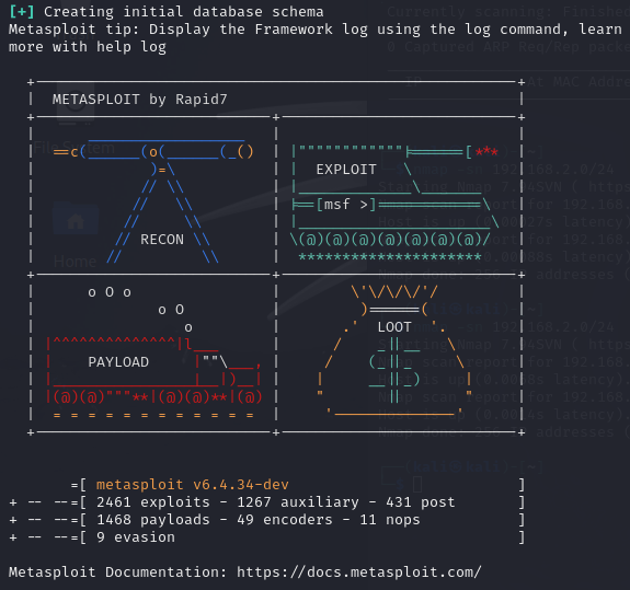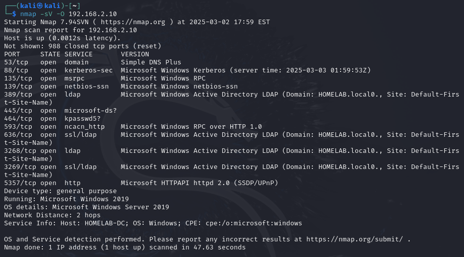
Transforming OpenVAS Vulnerability Data in Power BI
In this section, I took the vulnerability results from OpenVAS and transformed the data in Power BI to create meaningful visualizations. This involved exporting the data from OpenVAS, cleaning and transforming it in Power BI, and creating interactive charts and tables to analyze the vulnerabilities.
Objective
The goal was to:
- Export the OpenVAS scan results in XML format.
- Import and transform the data in Power BI to make it usable for analysis.
- Create visualizations, including a pie chart and tables, to highlight key vulnerability metrics.
Tools Used
- OpenVAS: For exporting the vulnerability scan results in XML format.
- Power BI: For data transformation, analysis, and visualization.
Steps Performed
-
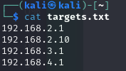
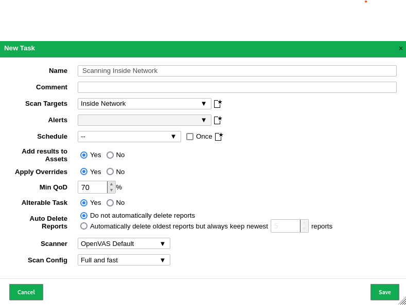
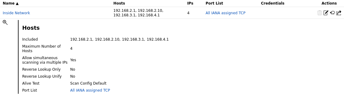
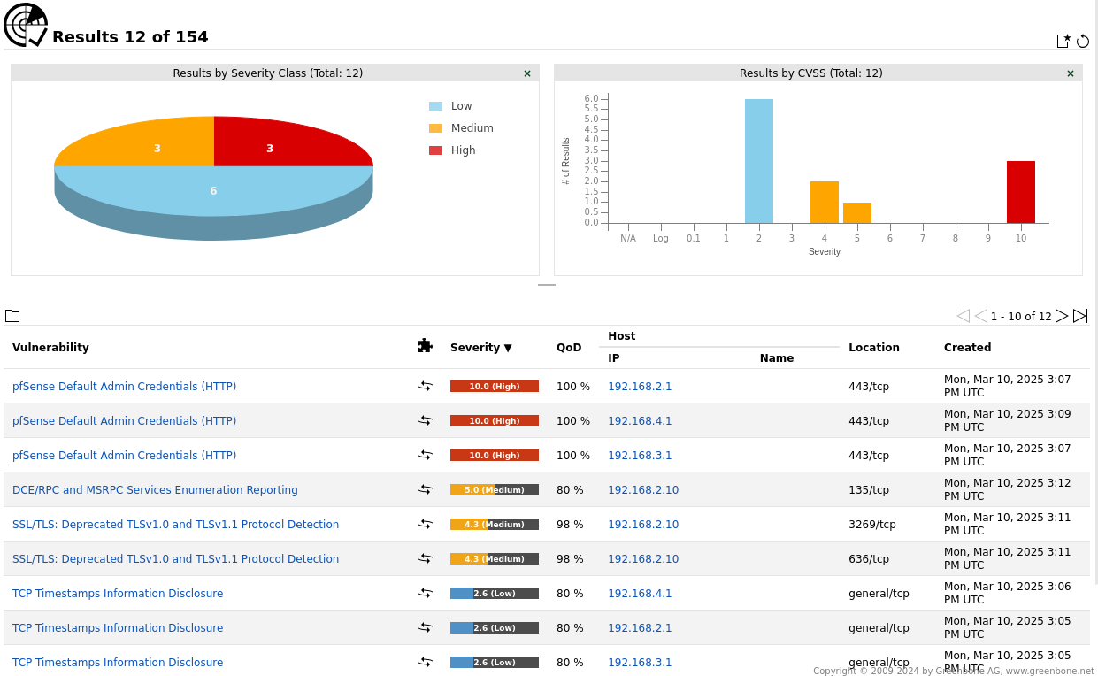
Exporting Data from OpenVAS
I exported the vulnerability scan results from OpenVAS in XML format using the web interface. Below is a screenshot of the export process:
-
Importing Data into Power BI
I imported the XML file into Power BI. Initially, the data appeared as a single row, so I used the Drill Down feature to expand the nested tables. Below is a screenshot of the initial data import:
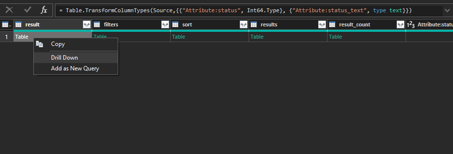
-
Transforming the Data
I navigated through each table, expanded the necessary columns, and removed irrelevant ones to clean the data. This included:
- Expanding the
resultstable to access individual vulnerability details. - Removing unnecessary columns like
timestampandhostthat were not relevant to the analysis. - Renaming columns for clarity, such as
threat_level,cvss_base, andnvt.family.
Below is a screenshot of the Power Query Editor showing the transformed data:
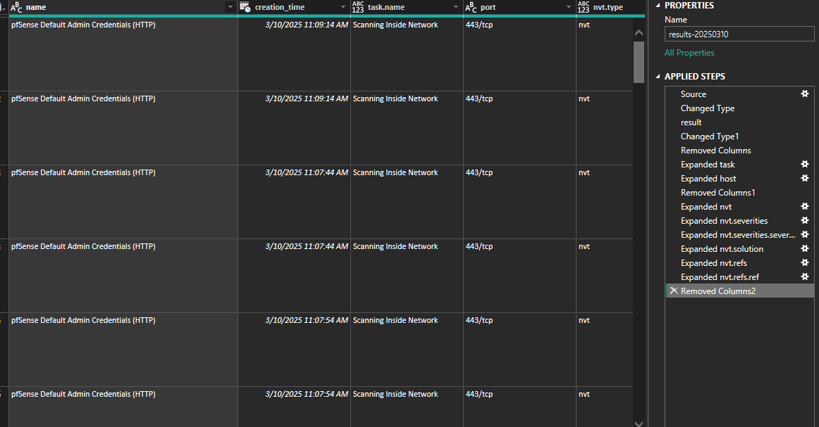
- Expanding the
-
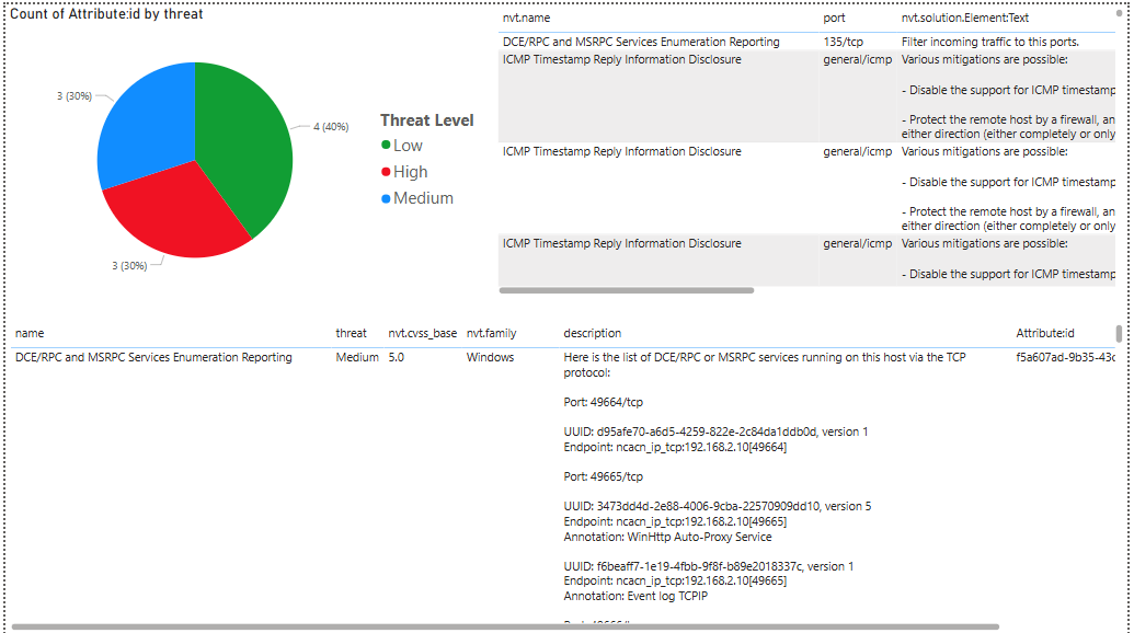
Creating Visualizations
After transforming the data, I created the following visualizations:
- Pie Chart: A pie chart showing the distribution of vulnerabilities by threat level (e.g., High, Medium, Low). This helps quickly identify the most critical issues.
-
Vulnerability Table: A table displaying key details about each vulnerability, including:
- Name of Threat: The name of the vulnerability.
- Threat Level: The severity level (e.g., High, Medium, Low).
- CVSS Base Score: The Common Vulnerability Scoring System (CVSS) score.
- NVT Family: The category or family of the vulnerability.
- Description: A brief description of the vulnerability.
- Attribute ID: A unique identifier for the vulnerability.
-
Port and Solution Table: A table to the right of the pie chart showing additional details, including:
- Name of Threat: The name of the vulnerability.
- Port: The port associated with the vulnerability.
- Solution Text: Recommended steps to remediate the vulnerability.
- Reference ID: A reference to a CVE or CB (Common Vulnerabilities and Exposures or Common Bug) identifier.
View the full Power BI project here.
Key Findings
- Successfully transformed raw OpenVAS XML data into a structured format for analysis in Power BI.
- Created a pie chart to visualize the distribution of vulnerabilities by threat level, highlighting the most critical issues.
- Developed detailed tables to provide actionable insights, including vulnerability descriptions, CVSS scores, and remediation steps.
What’s Next?
Based on the analysis, here’s what I plan to do next:
-
Remediate Vulnerabilities:
- Prioritize and address high-severity vulnerabilities identified in the pie chart.
- Use the solution text and reference IDs to implement fixes.
-
Enhance Visualizations:
- Add filters and slicers to make the Power BI dashboard more interactive.
- Include additional metrics, such as trends over time or vulnerability distribution by host.
-
Automate the Process:
- Set up automated data refreshes in Power BI to keep the dashboard up to date with new scan results.
Conclusion
This exercise demonstrated the power of combining OpenVAS and Power BI for vulnerability analysis. By transforming raw scan data into actionable visualizations, I was able to quickly identify and prioritize critical vulnerabilities. Moving forward, I will focus on remediation and enhancing the dashboard to support ongoing security monitoring.